Phong Vu had a bold vision for the future with a focus on customer experience and bringing the latest innovative technology to their customers. RED has brought this to life. The rebrand represents this strong, personal and bold ambition. The rich blue of the brand is a strong statement. The colour anchors the brand within the technology market while setting them apart from their local competitors.
Red Design Group worked with the client to define the Phong Vu brand attributes. Service, futuristic, innovation, O2O (offline & online selling), reliability and trust were words that they agreed would shape the brand personality. The brand represents an environment where people feel that Phong Vu is a brand for them.
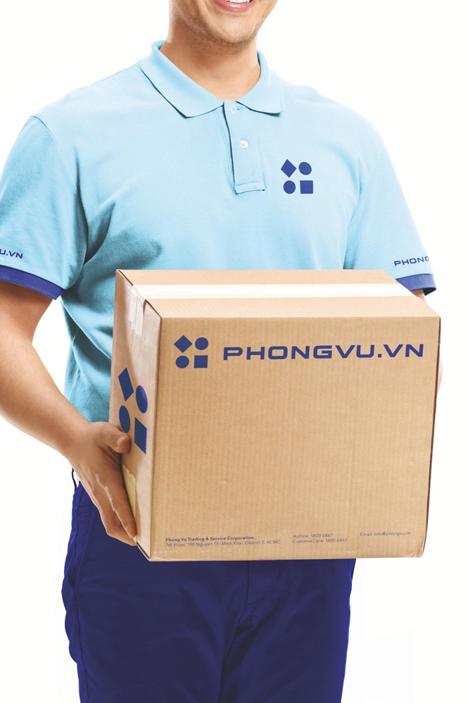
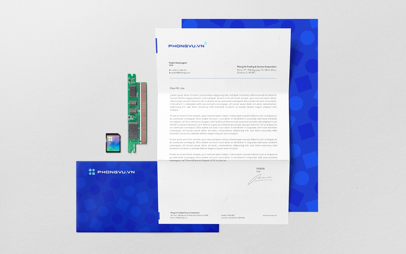
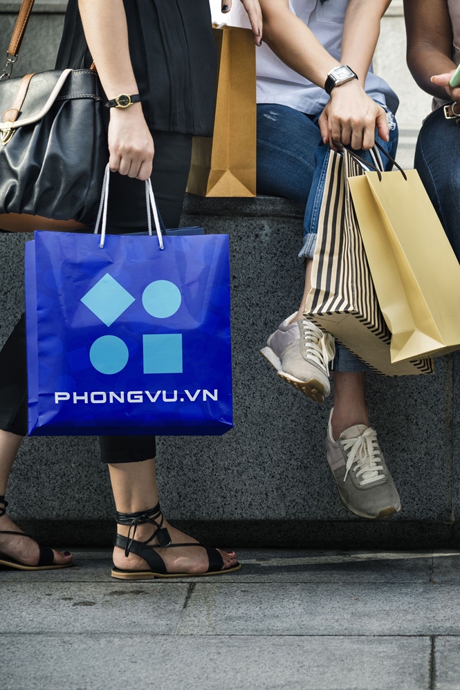
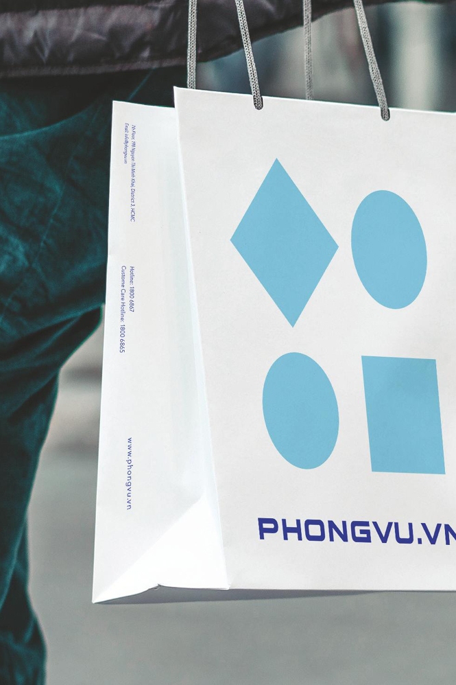
Referencing these attributes, the design process began. All brand elements from the logo through to packaging, signage, boxes, shopping bags, staff uniforms and marketing material were design by RED . A new interior concept is being developed for the company, which Phong Vu and Red Design Group are very excited about.
